Creating the JECS design system
JECS is a suite of edge computing solutions developed by Jio Platforms Limited to enhance data processing capabilities by bringing computational tasks closer to the data source. This approach reduces latency and improves real-time data processing, which is essential for applications requiring immediate responsiveness.
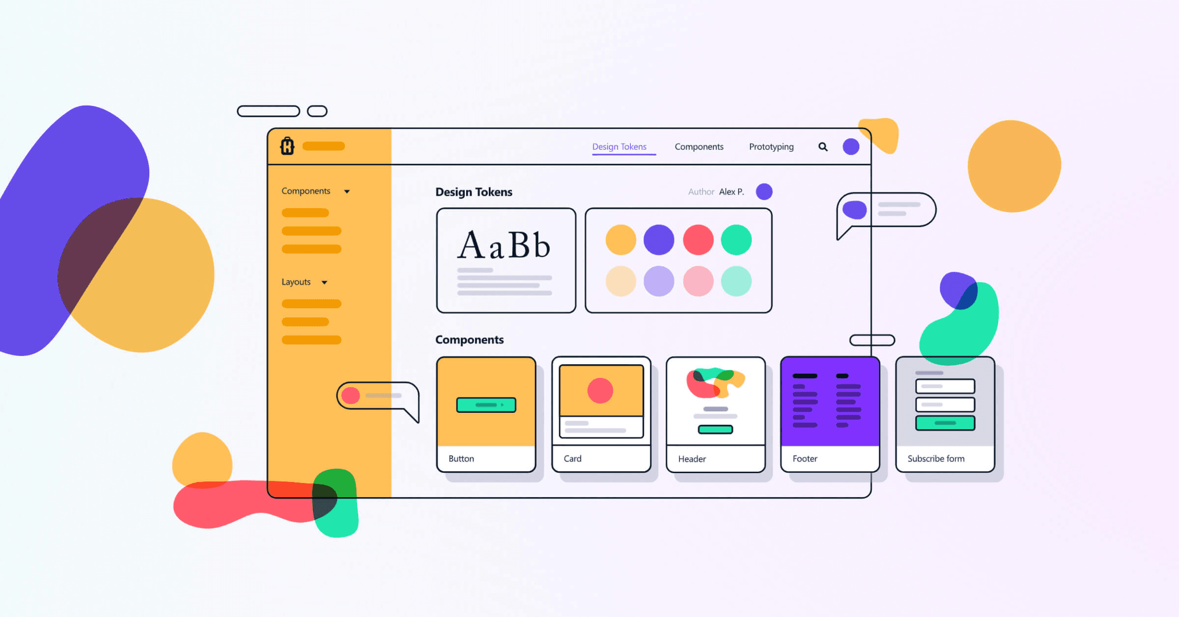
What is a Design System?
In summary, a design system is a set of standards to manage design at scale by reducing redundancy and maintaining consistency. A design system is a collection of documents, articles, examples, code snippets, screenshots, design guidelines, components, philosophies and other digital assets for a product design company. It’s usually hosted online as a website.
0.1 Project Overview
JPL had just launched a new product called JECS (edge computing solutions) but it lacked consistency. This happened because all these parts of the apps were designed at different times, by different designers having a different context. There was no unifying design philosophy or principles to guide them
These problems got worse when we started designing for any new page, product or feature. Also, because of no underlying specified design principles, a lot of time was wasted in debating and implementing design decisions. User experience also suffered because of lack of predictability and consistency.
So JECS needed a new design language that is unique to this new product but still complements the brand and stays true to its core brand values.
Duration
3 Months
Platform
Web App
02.Problem Statement
We identified the need for a new design system for our new product (JECS) to ensure consistency and efficiency across various features and interfaces. We recognised that without a design system, inconsistencies in design and user experience could lead to a confusing and frustrating experience for users and that could hurt brand’s reputation.
Goals
`````We wanted to drive consistency in all our products on different platforms and across different businesses which would result in great user experience.
Work through the basic design system and make it mature and robust.
We wanted to incorporate the new modern visual design trends in our app so that it looks fresh and is a delightful experience for the users.
My responsibilities
Lead on all things design system.
Carry out research and competitor analysis and identify best in class practises for a brand new design system.
Help create a design system that would help the designers and developers to bring consistency in the mobile app.
Team
2 Designers, 1 Developer, 1 Illustrator
03. Process
The process of creating a well structured design system had 3 phases, below is an overview:
Research
Finding the common standard of a successful design system.
Definition
Defined the element structure and guide to use.
Design
Designed all the necessary components.
Research
Following a series of interviews with individuals from various departments such as front-end developers, product managers, and marketing managers, we have recognised the need to accomplish two primary objectives:
`````1. Identify and address all the design-related challenges present in our product.
2. Learn the common standard and principles of a successful design system.
We wanted to incorporate the new modern visual design trends in our app so that it looks fresh and is a delightful experience for the users.
1.1 Benchmark
We had to find open source design systems that share common design principles as Pegasus. We picked these 3 as a result:
1.2 User Research
As we had not officially launched the web app we could not get user reviews. So we had to approach a different route. We tested our web app (with the old design system) with some users.
Key Findings:
1. The UI of the app was a bit outdated and needed a revamp.
2. The Primary colour looked a bit dull and needed to be a bit more brighter.
Definition
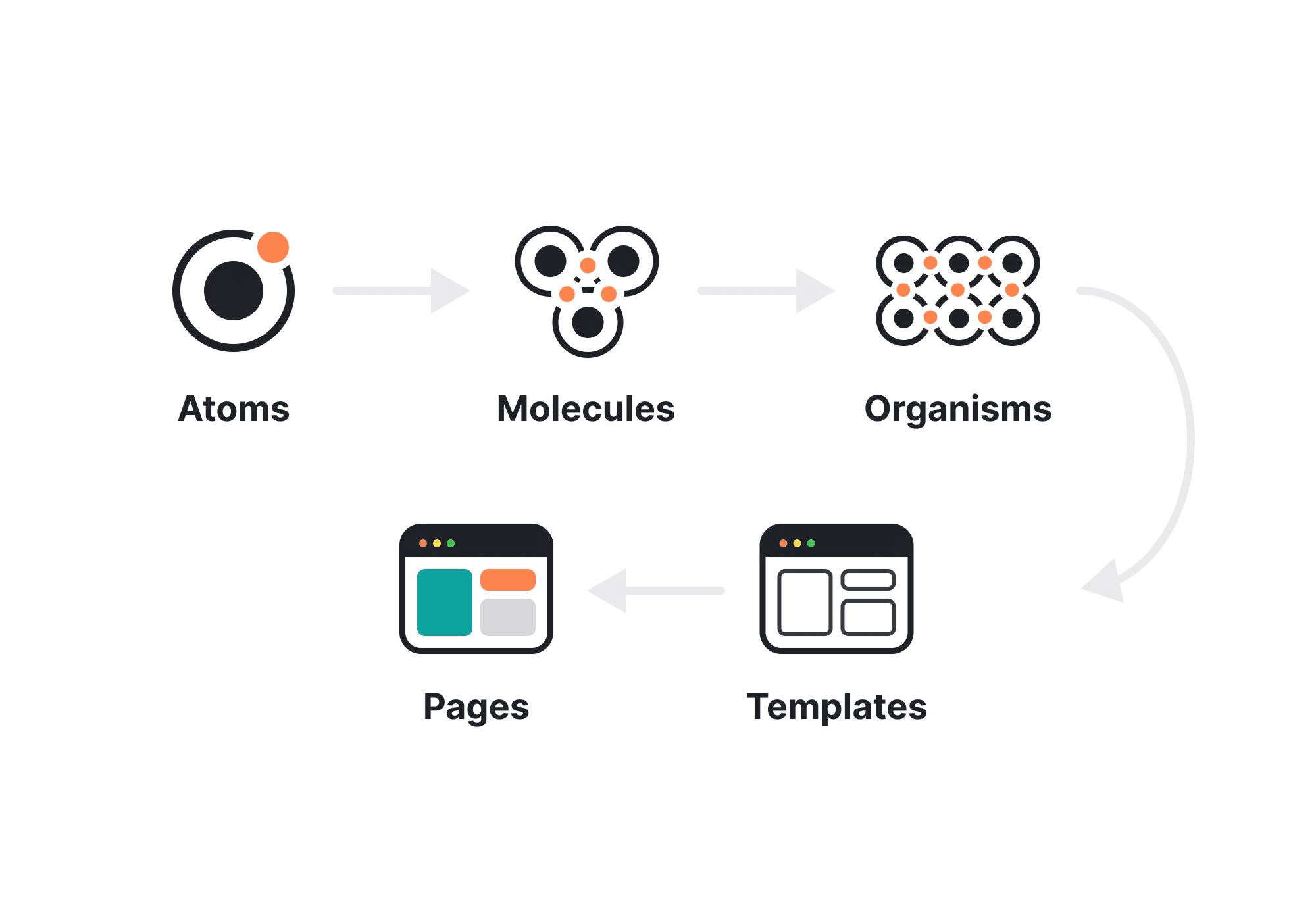
The major problem I faced while creating the design system was “How do I build the UIKit first without knowing how the interface will turn out? But also, how do I make the interface when we don’t even have a defined the UIKit? That’s when I read about Brad Frost, who introduced the Atomic Design methodology.
Going through all of this I concluded that moving directly to pages to develop a UIkit was not probably the best idea. The answer lied in building both of them parallelly and making changes to them simultaneously.
2.1 Building the structure
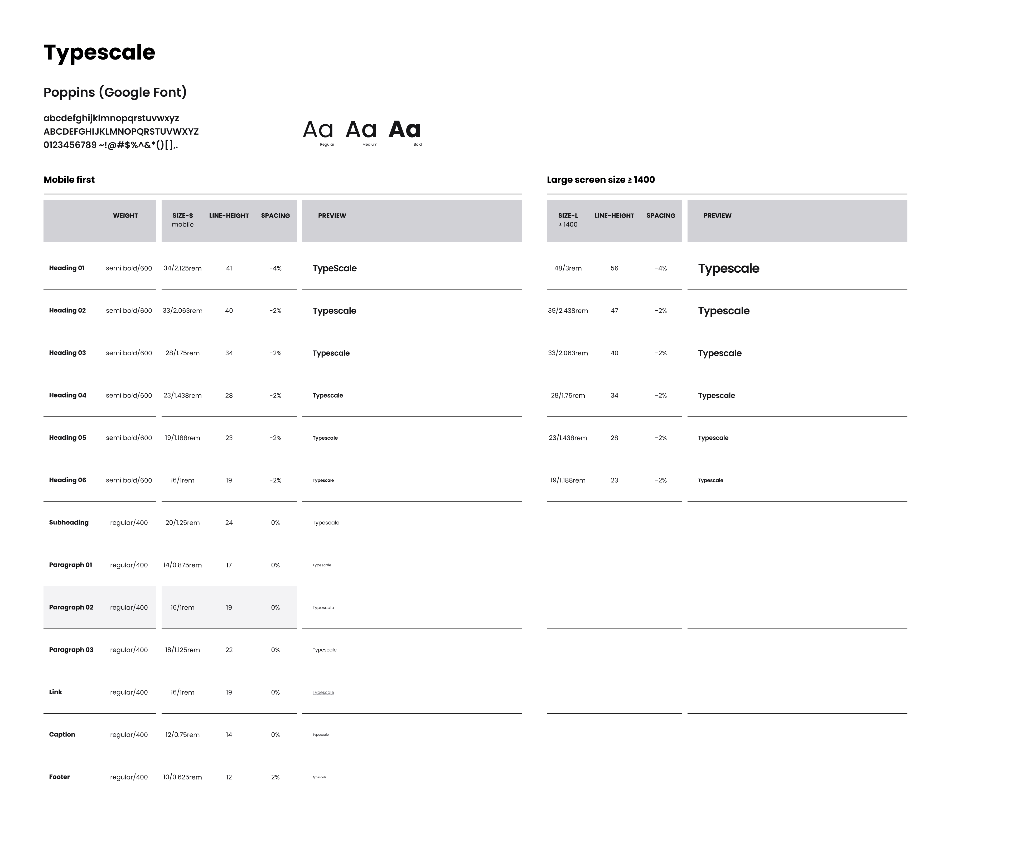
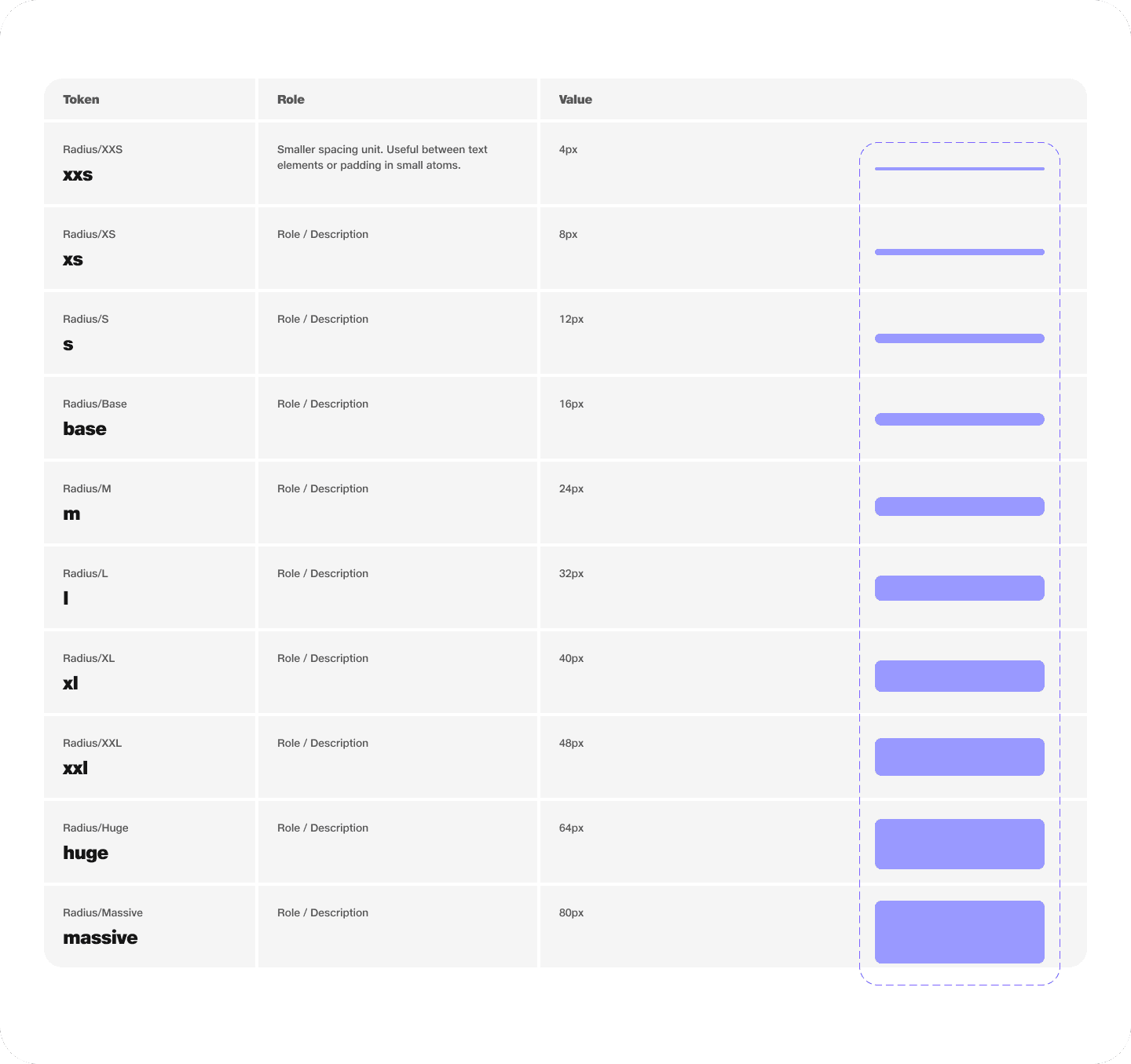
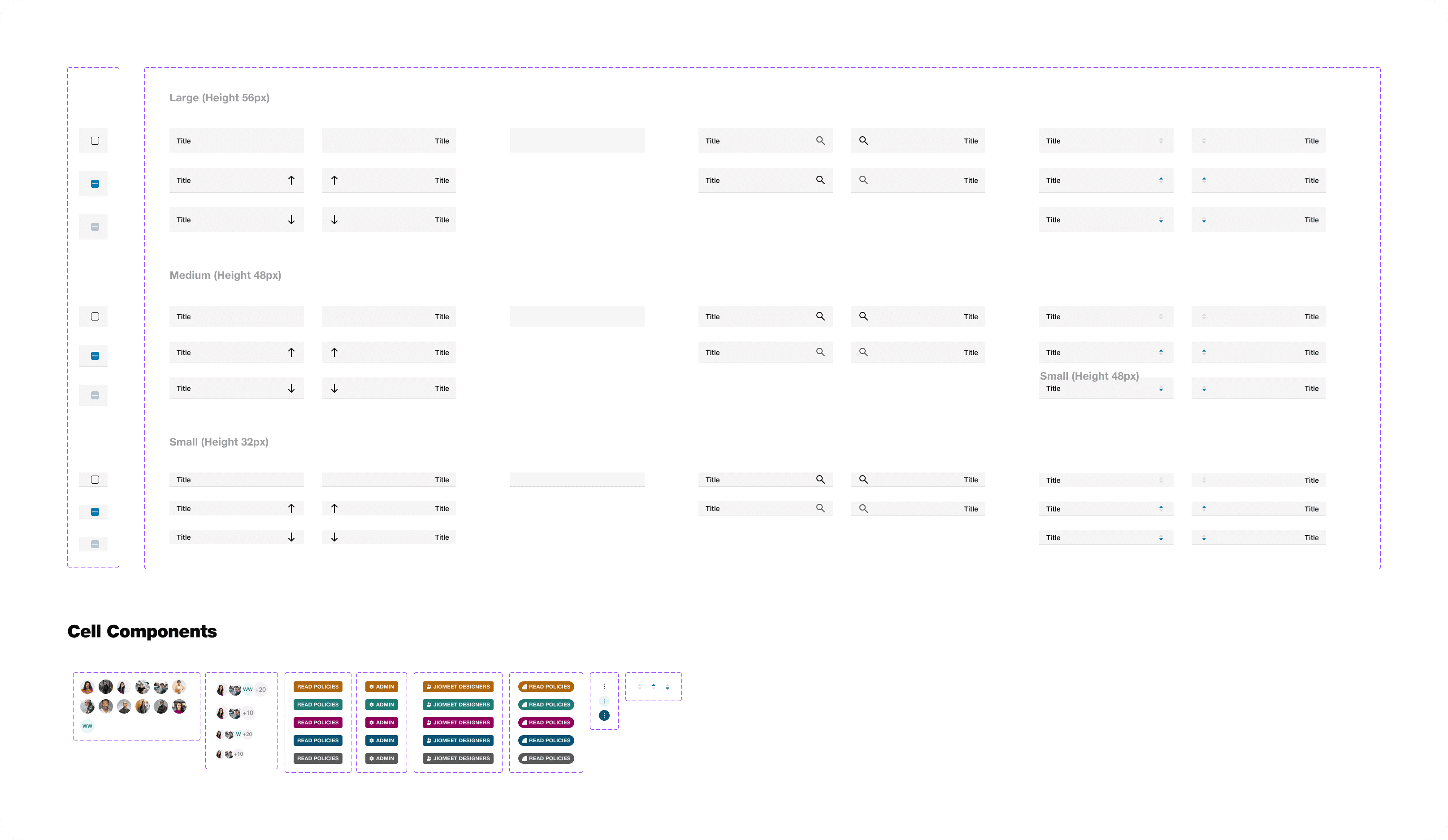
To begin with, we started designing basic atoms of our design system like typography, colours and spacing. Things got more interesting and tangible when we started combining these atoms together to form molecules like buttons, form fields, table cells etc.
Going through all of this I concluded that moving directly to pages to develop a UIkit was not probably the best idea. The answer lied in building both of them parallelly and making changes to them simultaneously.
Design
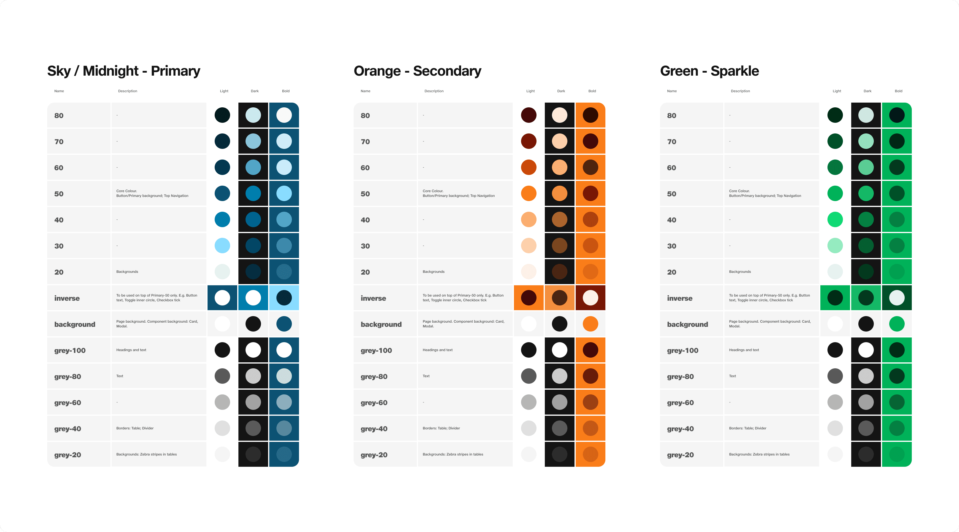
For the design part, we made sure that each of our components is Accessible, Intuitive and Aesthetic.
I decided to lay down a very basic UIKit for the designers to start mocking up designs using the basic components keeping in mind that these components will evolve to accommodate a proper built incorporating all the defined principles but with minimal breaking changes.
3.1 Icons
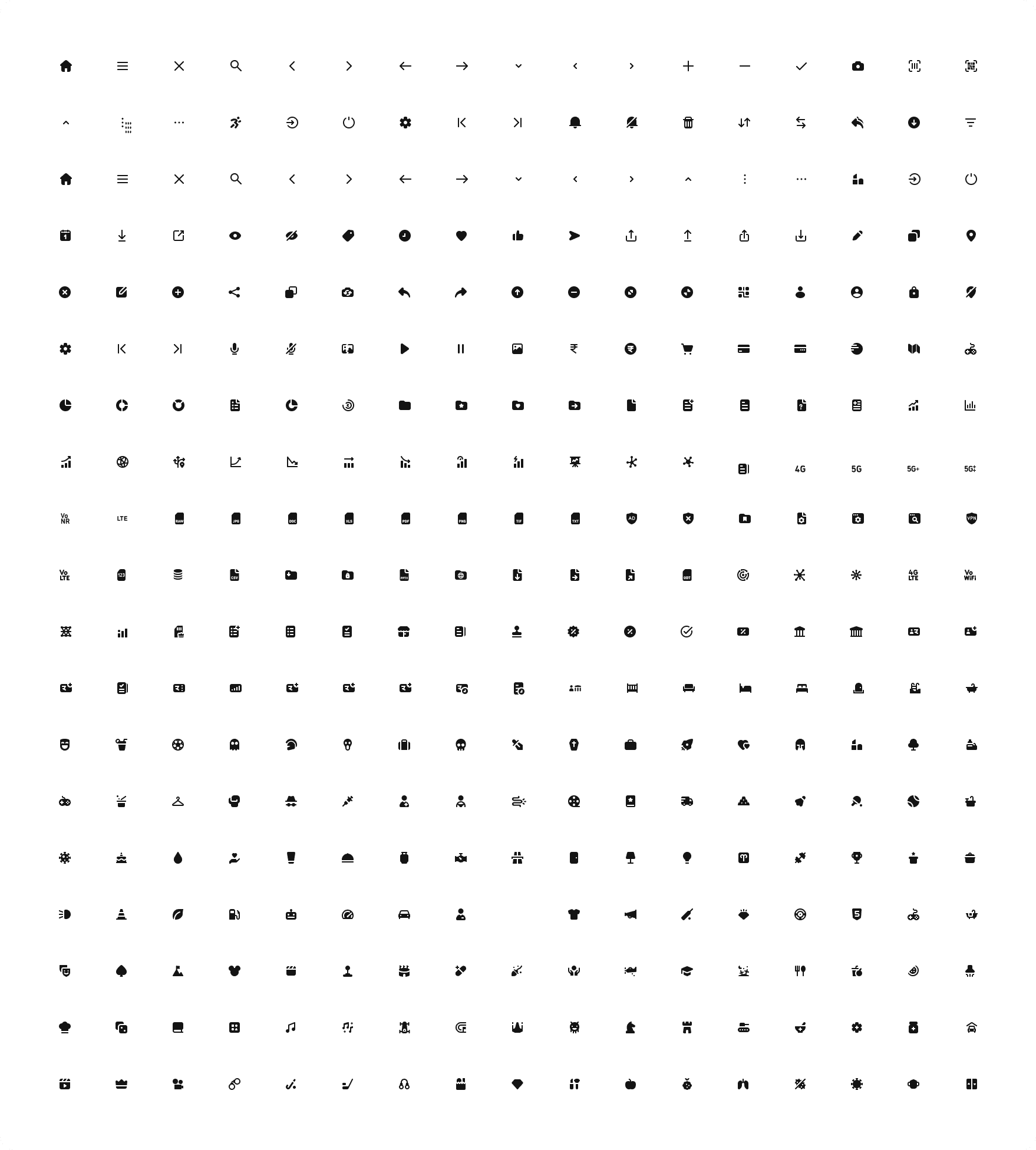
Icons are an essential part of any design system as they help communicate visual meaning quickly and effectively. They provide users with visual cues and enhance the overall user experience.
Our Illustrator helped us create these beautifully outlined icons :
3.2 Shadows
Icons are an essential part of any design system as they help communicate visual meaning quickly and effectively. They provide users with visual cues and enhance the overall user experience.
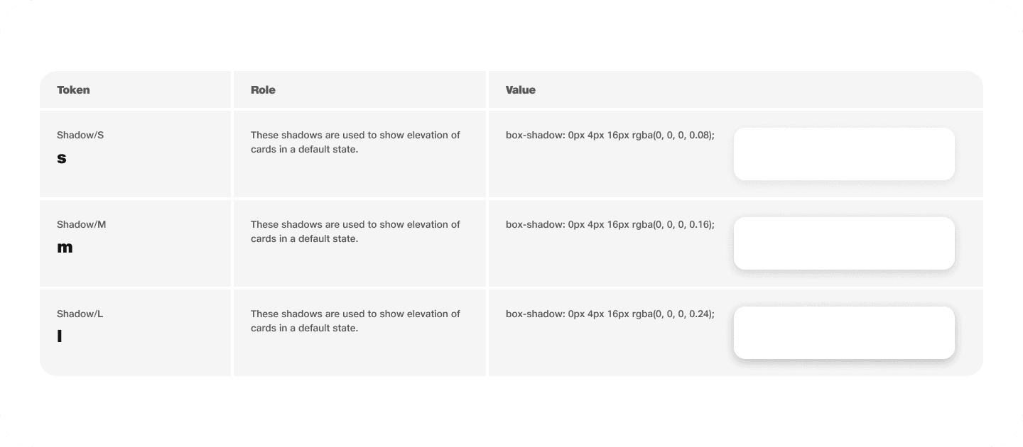
These four shadows should be enough to style every component in our system:
1. A subtle shadow to raise interactive components and add affordance.
2. A more pronounced shadow for a hover effect on components.
3. A strong shadow to give perspective to drop-downs/popovers and other similar components.
4. A distant shadow for modal components.
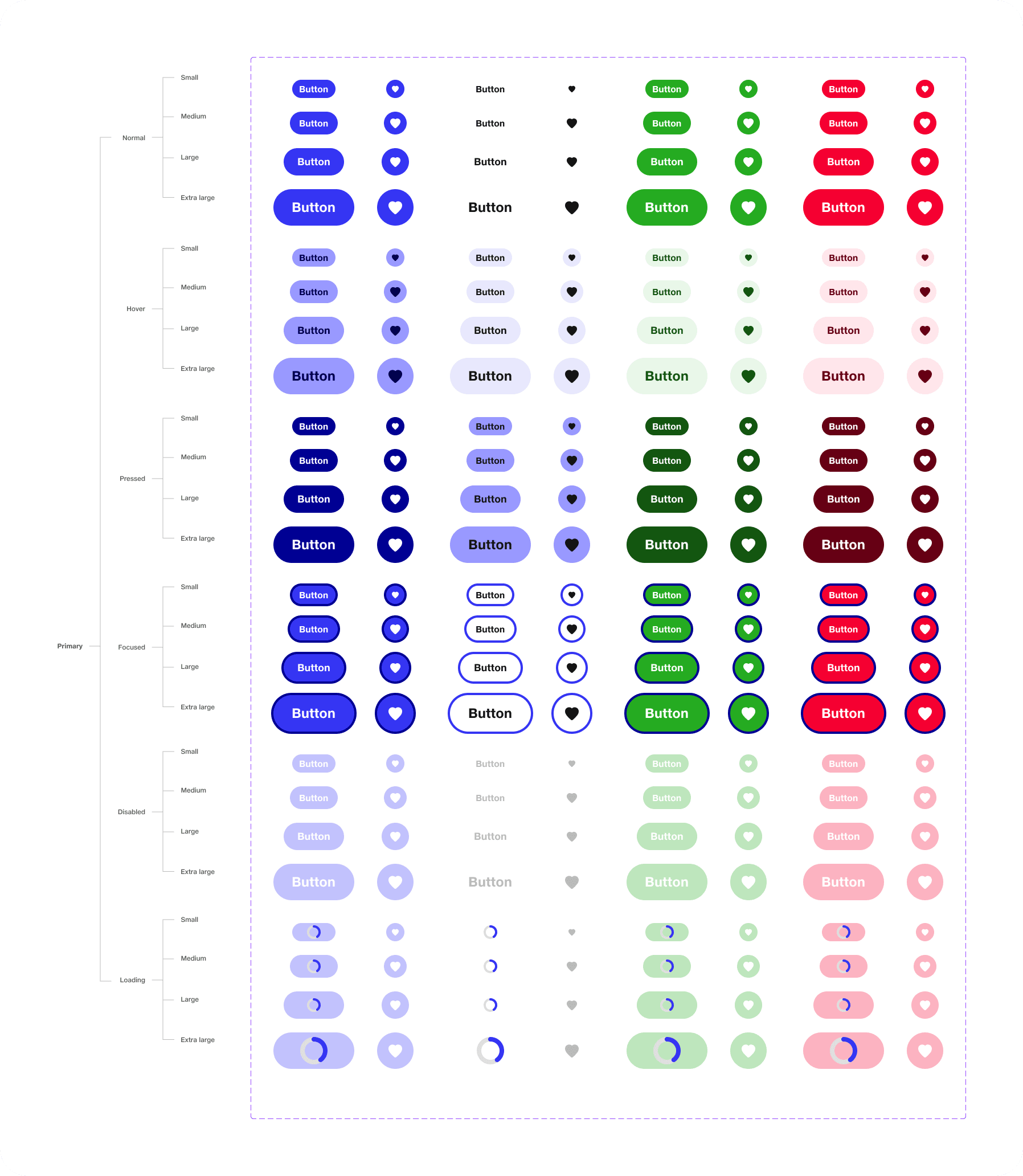
3.3 Buttons
Buttons are fundamental components in any user interface, serving as actionable elements that enable users to interact with your product.
When designing buttons, it’s essential to strike a balance between aesthetics and functionality. Buttons should be visually appealing while clearly communicating their purpose.
Figma’s component system enables you to create reusable button components that can be easily customised and scaled.
These were some of the variants for the default button:
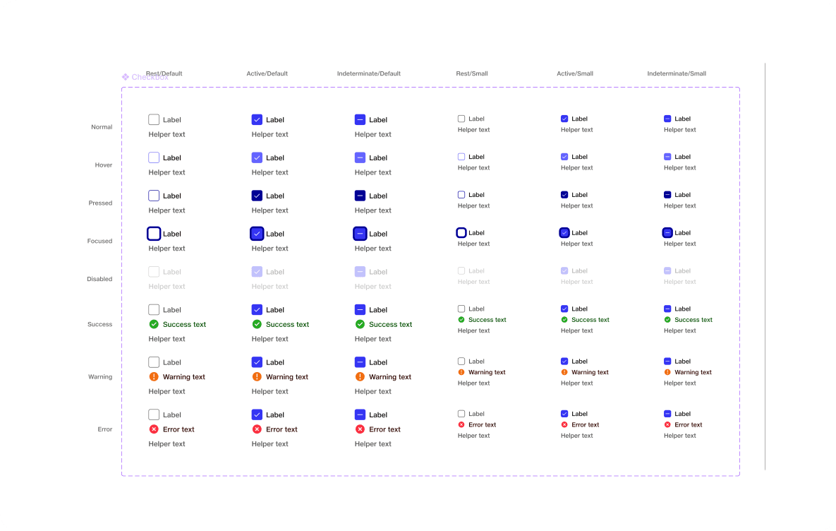
3.4 Check box
Checkboxes are essential elements in user interfaces that allow users to make selections or indicate preferences.
When designing checkboxes, it’s important to focus on clarity, accessibility, and intuitive interactions.
These were some of the variants we needed:
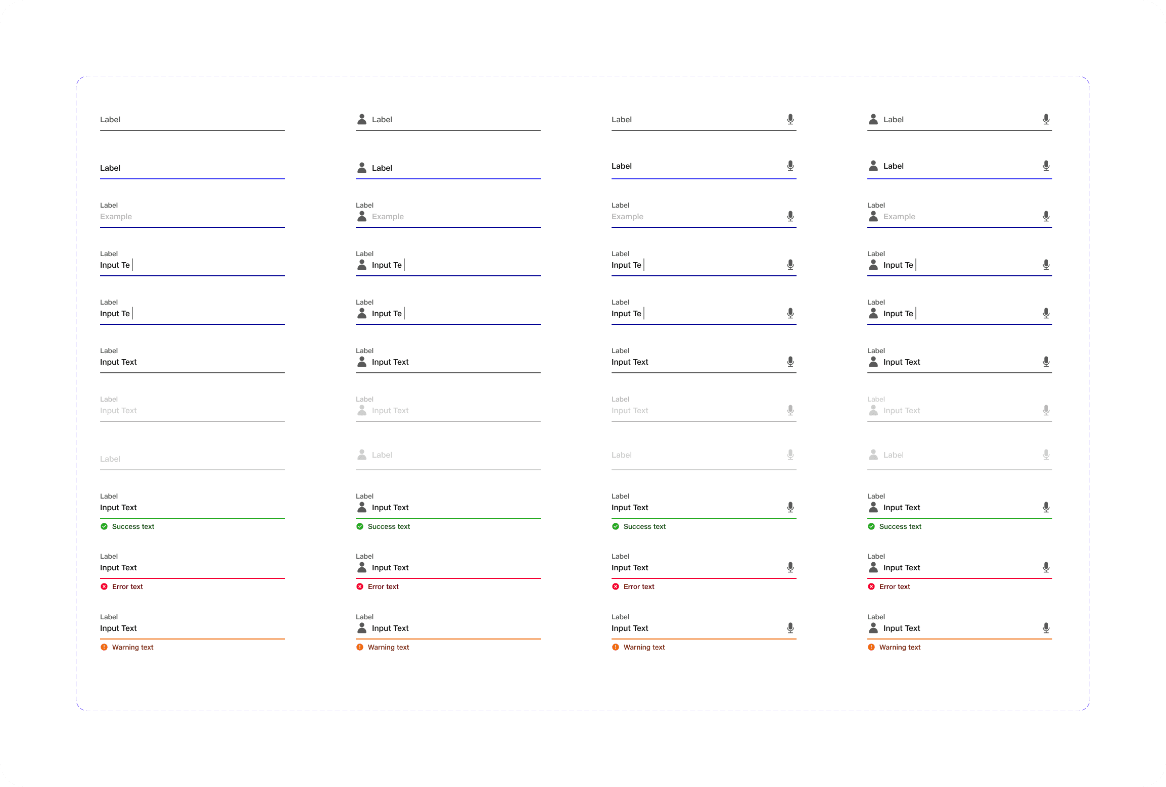
3.5 Input fields
Textfields are crucial interactive components that allow users to input text or data. Designing textfields involves considering both functionality and aesthetics.
1 thing we needed to consider was to ensure that textfields have a clear purpose and are easy to understand. Use descriptive labels and provide clear instructions or placeholder text to guide users on what type of input is expected.
These were some of the variants I came up with :
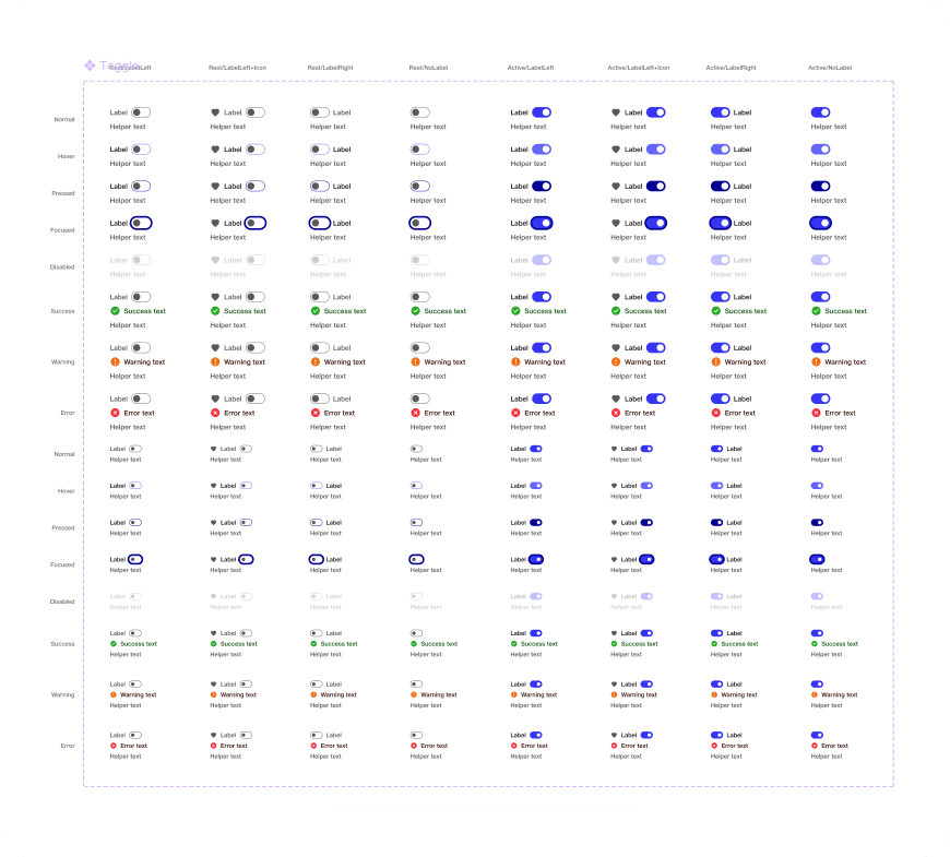
3.6 Toggle
Toggles are interactive components that allow users to switch between two mutually exclusive states, such as on/off or active/inactive.Designing toggles involves considering clarity, simplicity, and ease of use.
These were some of the variants we used:
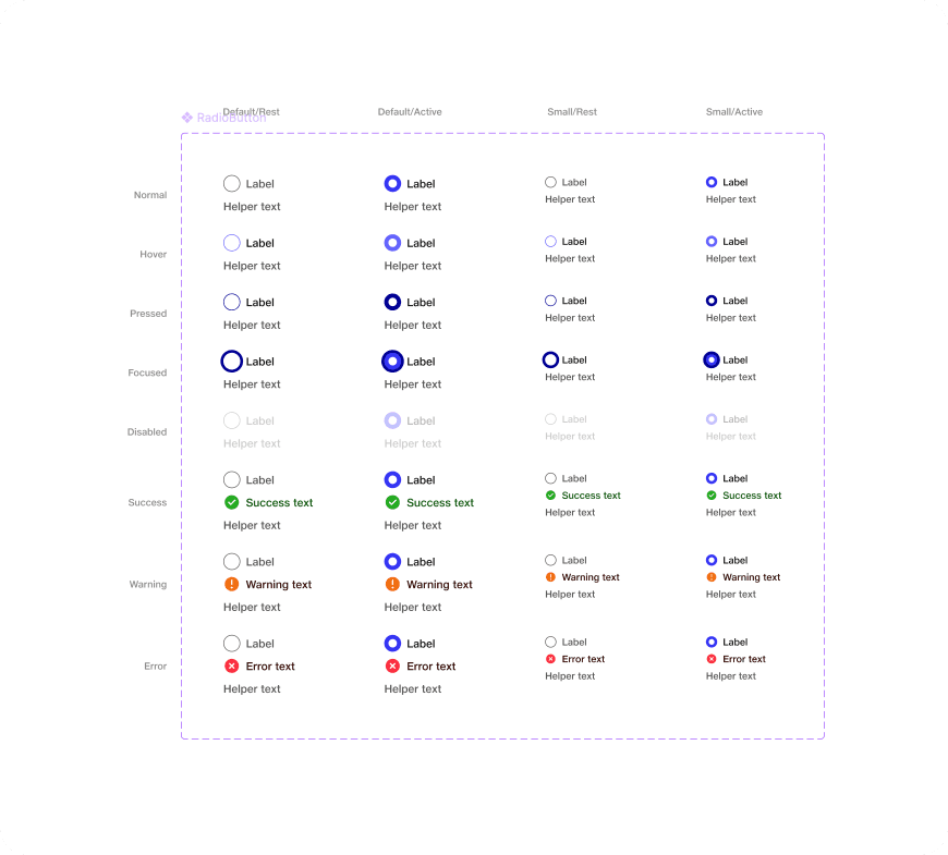
3.7 Radio button
Radio buttons are interactive components that allow users to select a single option from a list of mutually exclusive choices.
Ensure that radio buttons have a clear visual indication of their selection state. We needed to use distinctive labels, or visual cues that clearly differentiate the selected option from the others. This helps users understand their current selection at a glance.
3.8 Tooltip
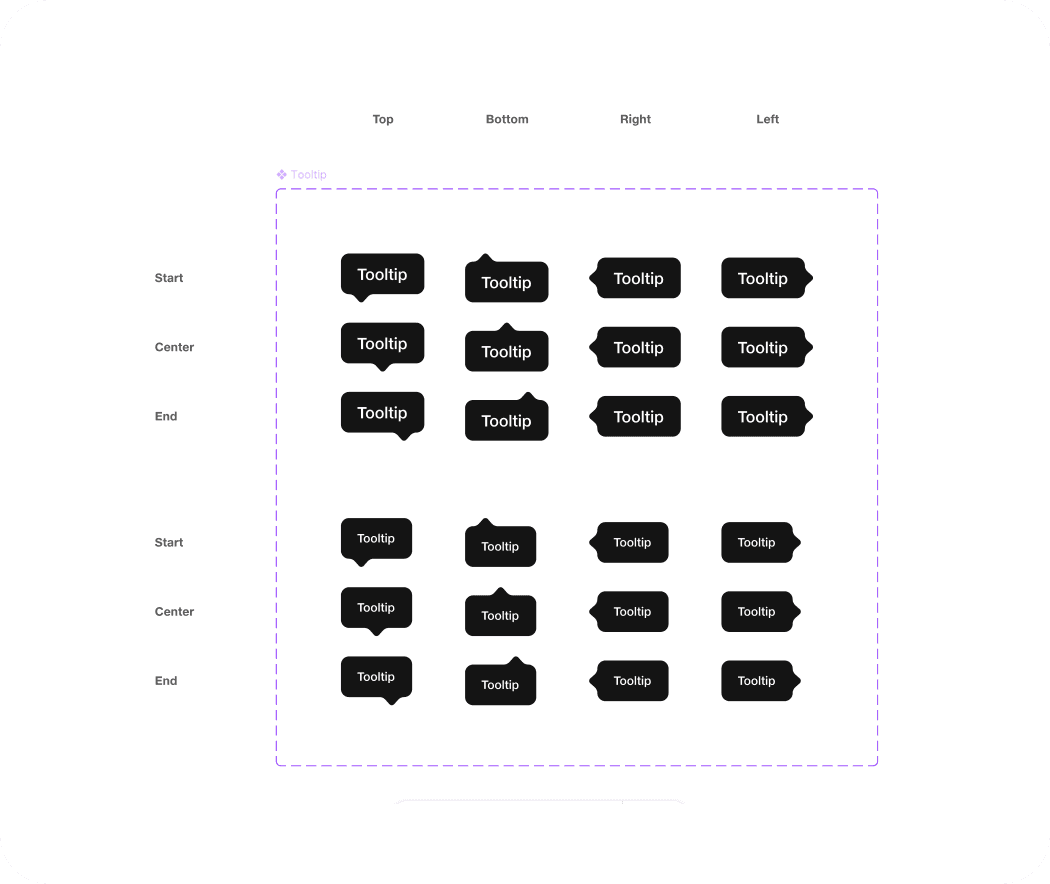
Tooltips are small information pop-ups that provide additional context or explanations for elements on a user interface.Designing tooltips requires careful consideration of their purpose, appearance, and interaction.
These were some of the variants we used:
3.9 Tags
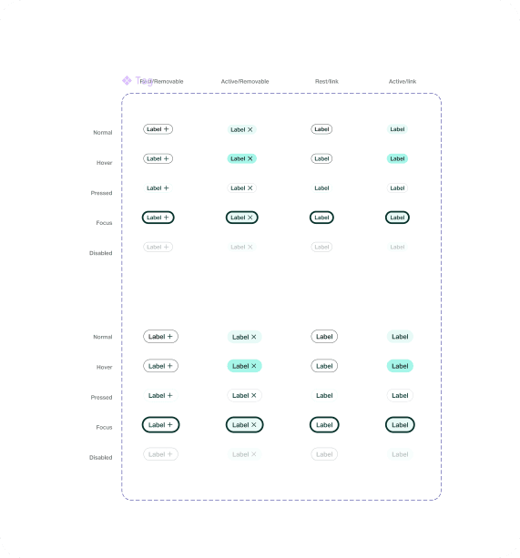
Designing tags involves considering their purpose, appearance, and usability. My motive was to ensure that tags have clear and concise labels that accurately represent the associated content or category. Use short, meaningful text or visual icons to convey the purpose or context of each tag.
3.10 Table
Designing tags involves considering their purpose, appearance, and usability. My motive was to ensure that tags have clear and concise labels that accurately represent the associated content or category. Use short, meaningful text or visual icons to convey the purpose or context of each tag.
0.4 How did this help JECS and its stakeholders?
Designers
It has become a lot easier to create, share and synchronise quite an extensive set of components at a much faster rate. Also, going forward it will eventually help us in easy knowledge transfer to the new team members.
Developers
The component library they created based on the UIkit helped them maintain the sanity of code and consistency in the final product.
Company
We achieved the goal of making all the businesses look consistent across platforms.
0.5 Learnings
Building this design system took a lot of time and there was a lot of back and forth. But it was definitely worth the effort. It has significantly improved our workflow, consistency across our products, and collaboration across the organisation.
I was able to collect lots of inspiration from different resources all over the internet. Collecting different UI kits and also using different design systems helped me a lot.
And that’s a wrap! If you liked this case study, please give it a clap! 🙂