Re-designing the JioEvents Web App - UI/UX Case Study
Complete overhaul of a event management platform to improve usability, streamline workflows, and enhance overall user experience. The goal was to create a more intuitive and efficient platform for both Event organiser/Host and Attendee.
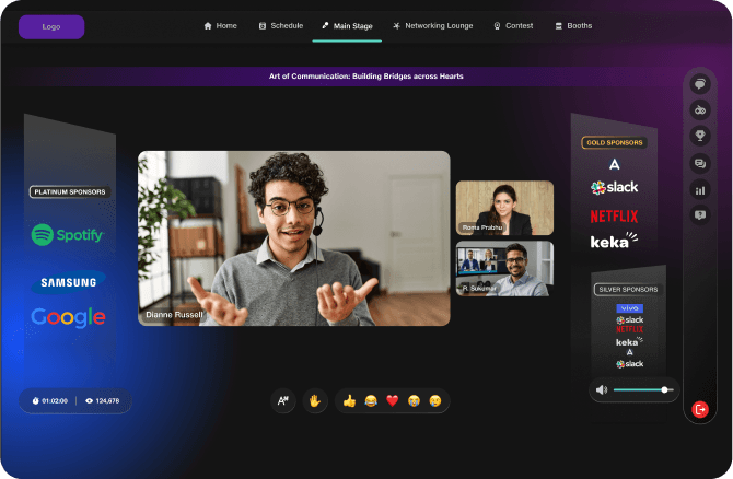
About the project
During the COVID-19 pandemic, the organization developed a virtual meeting platform. As events increasingly moved online, it became evident that meetings and events had unique requirements. To address this, we created a tailored event-specific extension of the meeting platform, incorporating additional features and functionalities to better support the evolving needs of virtual events.
However, the events industry is expansive and constantly evolving, demanding more than just basic functionality. To stay ahead of industry trends and meet these growing demands, we reimagined the platform, making it more dynamic, feature-rich, and visually captivating, ensuring it provides a comprehensive solution for modern event needs.
Problem Statement
How can we elevate the overall experience of planning, hosting, and attending virtual events to make them more seamless, engaging, and impactful?
This was accomplished through a complete product redesign that focused on addressing key needs such as improving user experience, boosting audience engagement, providing more monetization opportunities for organizers, and offering advanced reporting and analytics capabilities, among others.
My Role
As a senior product designer I played a key role in planning and execution of this redesign project. I was actively involved in all stages of the execution and contributed significantly in Ux, UI, planning and research of the project.
My key responsibilities included the following:
Stakeholder Collaboration
I regularly collaborated with the stakeholders to align with the product and business goals. I ensured through all stages of this project that design, dev, PM and business were on the same page.
Design System Implementation
Ensured and inspected regularly that the product design system was implemented properly to maintain consistency and brand identity.
UI & Interaction Design
I design intuitive and visually appealing interfaces for the JioEvents platform across both mobile and web, ensuring a seamless and engaging user experience. By maintaining consistency with Jio's design system and brand guidelines. I create cohesive and recognizable designs that align with the company's identity. Additionally, I focus on optimizing layouts, buttons, and interactions to enhance usability and drive higher user engagement, making the platform more efficient and enjoyable for event organizers and attendees.
Redesign Approach (Solution)
4.1 Understanding Event Industry
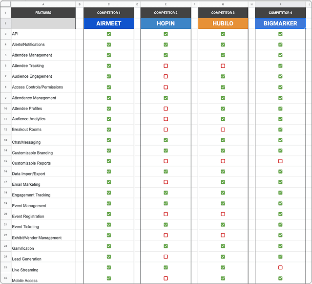
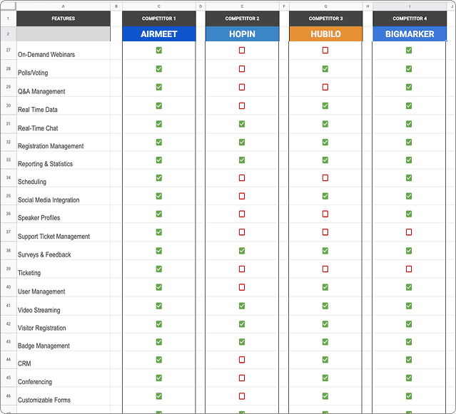
We tried to attend physical and virtual events to understand all target users’ journeys while creating, conducting and attending the events. We also did a secondary research to help us understand event industry and current trends in the industry. Competitor analysis gave the clear picture of the virtual events industry landscape. We studied and compared leading event platforms on basis of over 125 parameters to get a clear picture of event industry.
Positive Feedback
Trust in the brand.
"We've used this platform multiple times, and we trust the brand."
Simplicity of Product
"Setting up and creating the event was effortless."
High-Quality Streaming & Tech Reliability
"The video and audio quality were excellent—no lag, no crashes, just a smooth experience. It was a professional setup that made it easy to focus on the content."
Sponsor Benefits
"The platform provided great visibility to our sponsors that made our sponsors trust in us more for upcoming events"
Pain Points
Low engagement during live events
"Despite having great speakers, engagement tools like Q&A and polls weren’t used much, making sessions feel one-sided."
No networking option
"As an attendee, I was looking for connecting with people with similar interests in this event but there was no way to do so."
Poor reports and analytics
"Post-event analytics were too basic—we couldn’t get detailed insights on attendee behavior or engagement."
Scheduling multiple sessions was difficult
"Sessions with pre-recorded content wasn’t easily integrated into the schedule, making hybrid events difficult to manage."
Event felt dull
"Despite of having fully energetic speakers and highly engaging event content, overall virtual event felt very dull due to old styled look and feel. It felt ike attending an online meeting"
Ticketing Challenges
"The platform’s ticketing options were limited, making it hard to create multiple pricing tiers or discount codes."
4.4 Building from Insights
Insights gathered from above helped us ideate, evaluate and execute the designs. This ensured the informed design decisions while reshaping the product.
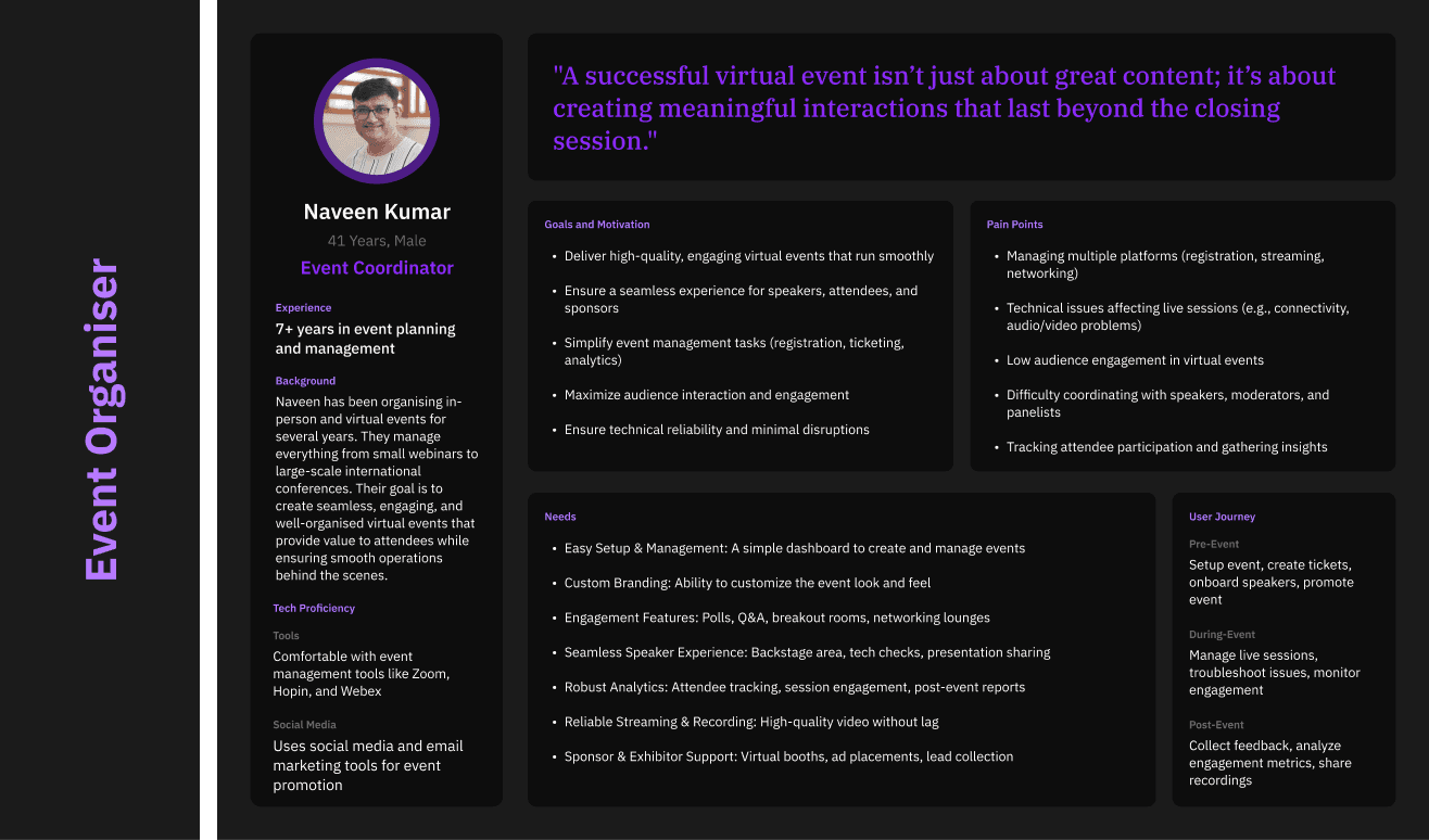
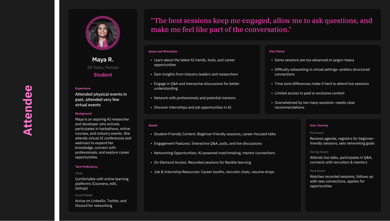
Redefining User Persona's

Focus areas for redesign
From above insights and expected needs of all user personas, we identified the areas to focus while redesigning the product. Although following are the areas to be focused while redesigning, entire UI redesign with new design system and enhanced overall experience was a prime focus of this project.
Organiser/Host

Easy, simplified customisation options in event page, inside event, post-event

Quick and hassle-free event creation

Comprehensive reports and analytics with success matrix

Intuitive and simple dashboard to manage all event related activities, track events and explore events

Simple UI and better categorisation of actions for event creation, planning and hosting

Speaker/Panelist

Hassle-free event joining and navigation

Easy communications with host, other panelists and attendees

Prompt feedback from attendees in form of reactions, written comments or questions
Attendee

Overall engaging experience throughout the event from discovering of event to attending and post event

Better Networking
Better way to networking with people in event than just chats or comments

Easy Navigation
Easy navigation throughout the event, same as physical event

Events Discovery
Way to explore all events on platform, show interest, follow organiser and attend interested events

Appealing UI
UI should hook attendees to join event, stay in event and take active participation

Interactivity
Making the experience interactive to keep attendees hooked to the event
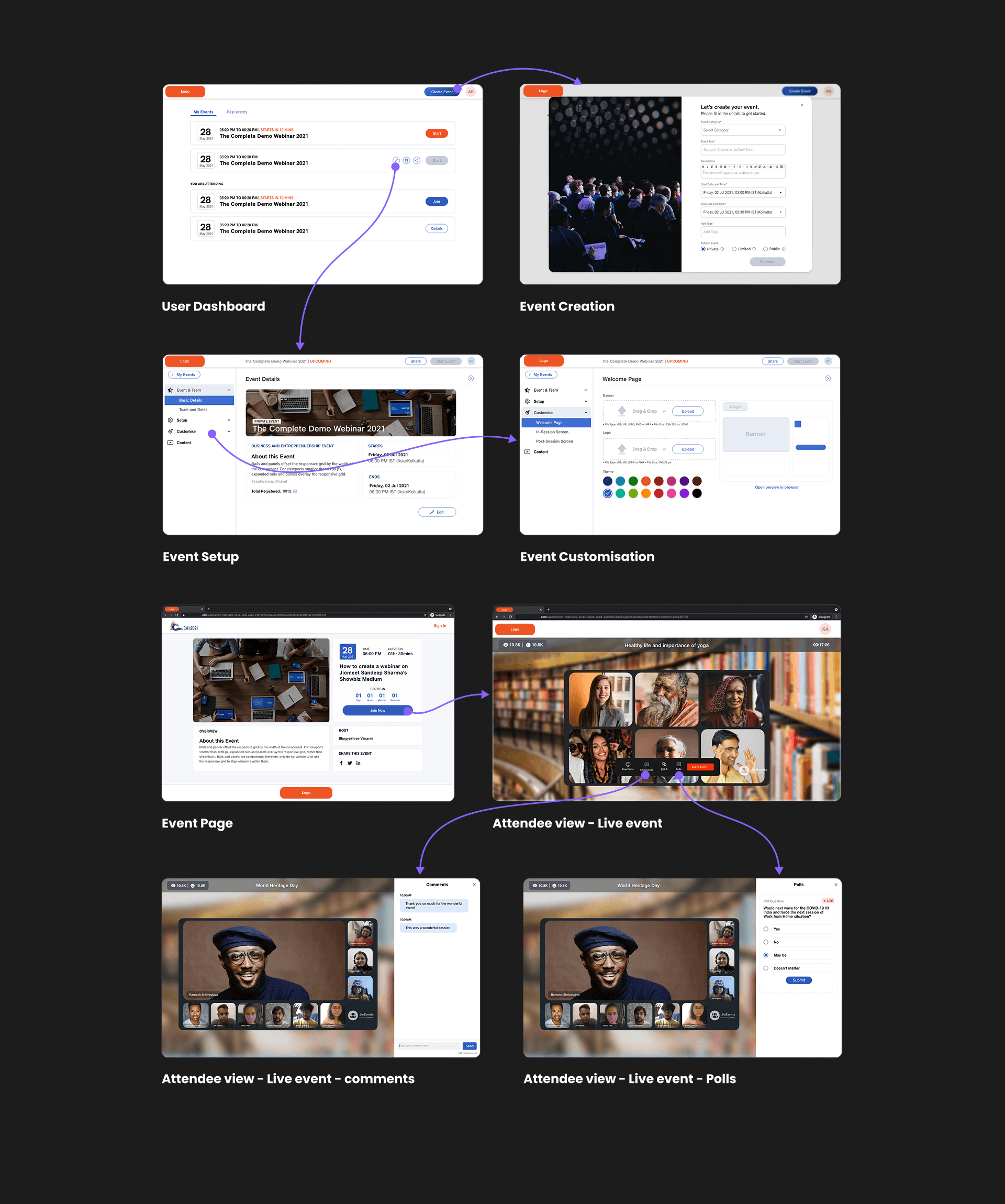
Old but not gold!
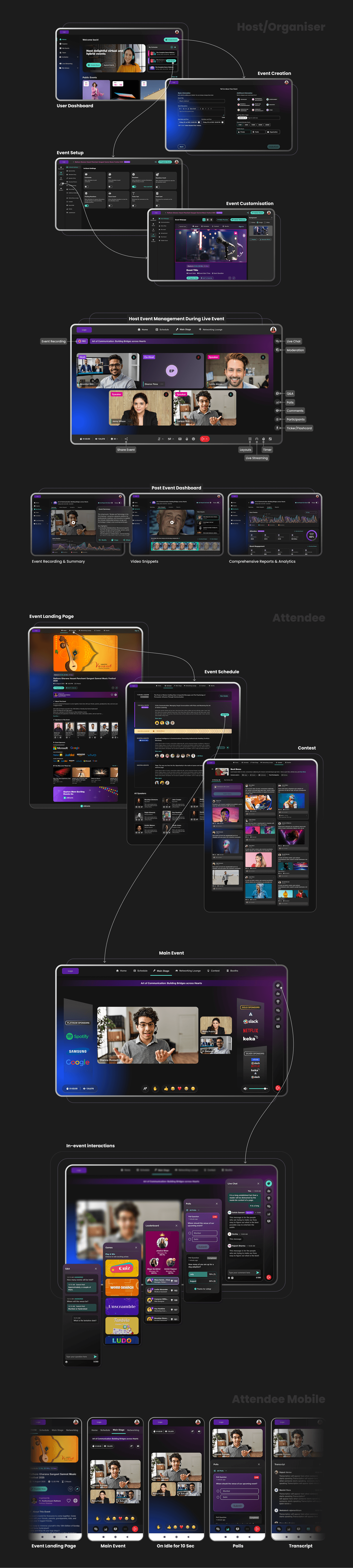
Re-Designed UI
Evaluation
We evaluated the redesign of the product by two methods:
Qualitative Evaluation
We conducted evaluation sessions with our existing customers to collect their feedback on the redesigned product. This process involved user interviews to gain qualitative insights and A/B testing to compare the performance of the new and old designs, ensuring a data-driven assessment of the redesign's effectiveness.
Quantitative Evaluation
We gathered and analysed key performance indicators (KPIs) from both the old and redesigned product to assess the impact of the changes. This included metrics such as the number of customers onboarded, user retention rate, user ratings, Customer Satisfaction (CSAT) score, and other critical performance measures to evaluate overall improvement.
Conclusion
The evaluation of the redesigned product produced highly positive and satisfactory outcomes, confirming the success of the redesign and its significant impact on key product performance indicators. The improvements were reflected in enhanced user engagement, better usability, and increased conversion rates. Additionally, user feedback played a crucial role in identifying areas that required further refinement. Any critical issues or concerns raised during the evaluation were carefully analysed and addressed to ensure a seamless user experience. Following these refinements, the new design was fully implemented, reinforcing the product’s overall effectiveness and alignment with business objectives.
I hope you find this case study helpful and interesting. Thank you for reading! 🙂